Data Visualization
Summary: Various pieces of data visualization completed while studying Communication Design at Washington University in St. Louis at the Sam Fox School of Design and Visual Arts.
Timeline: 2 weeks
Challenge: Visualize a vast amount of information on a large scale to demonstrate a significant finding from the data.
Solution: For both pieces of data visualization, I used color to delineate different values of data. I also included a few different visualizations of the data so that the user can achieve multiple perspectives.
Software: Adobe Illustrator

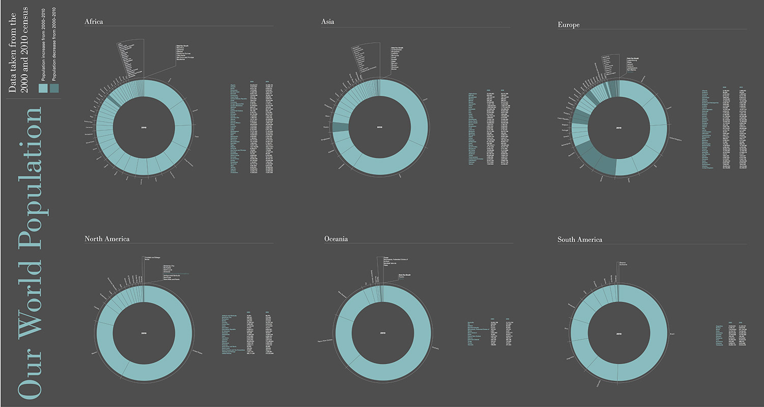
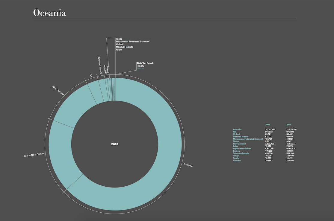
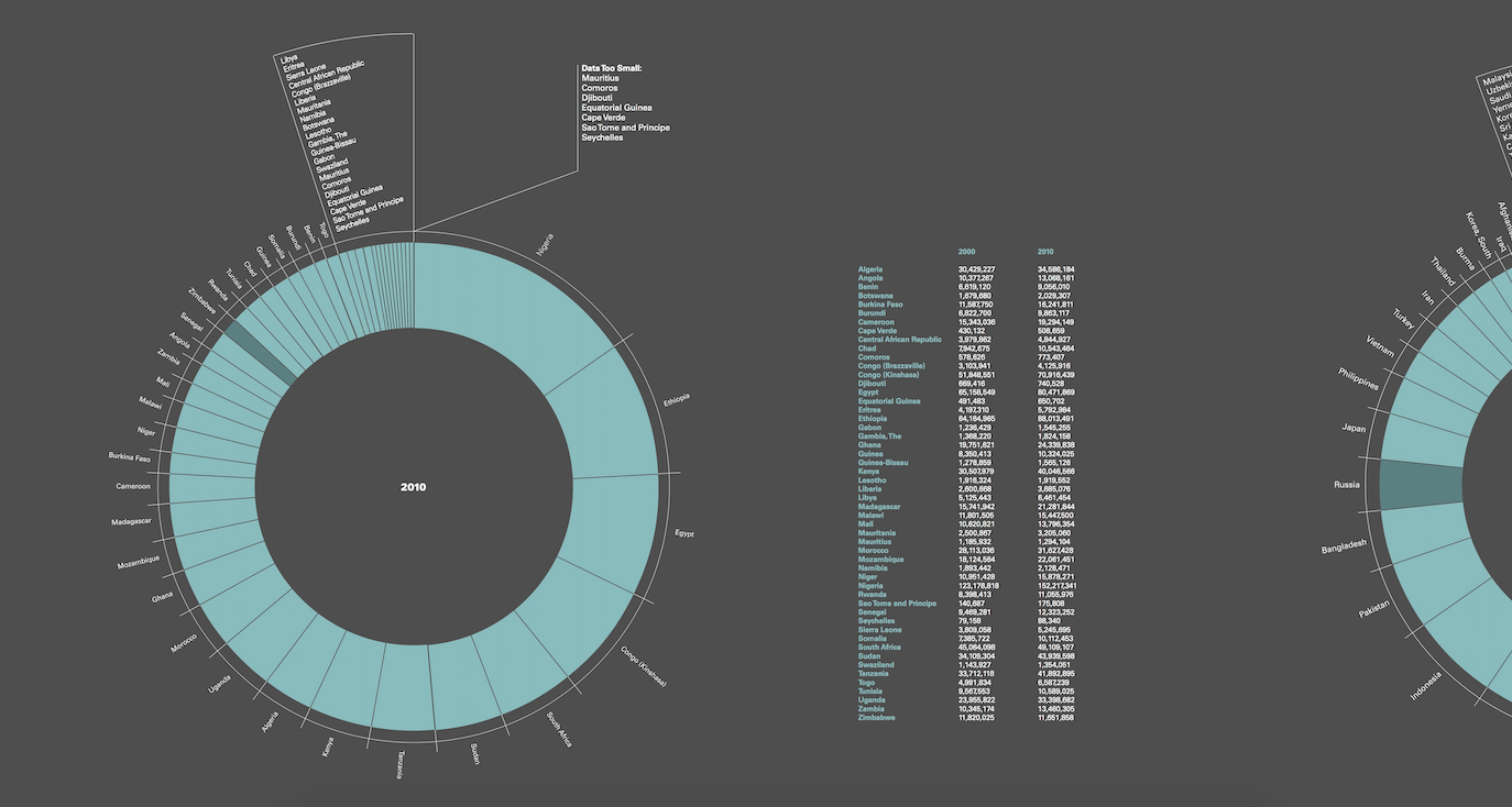
World Population Infographic
Zoomed in elements below.
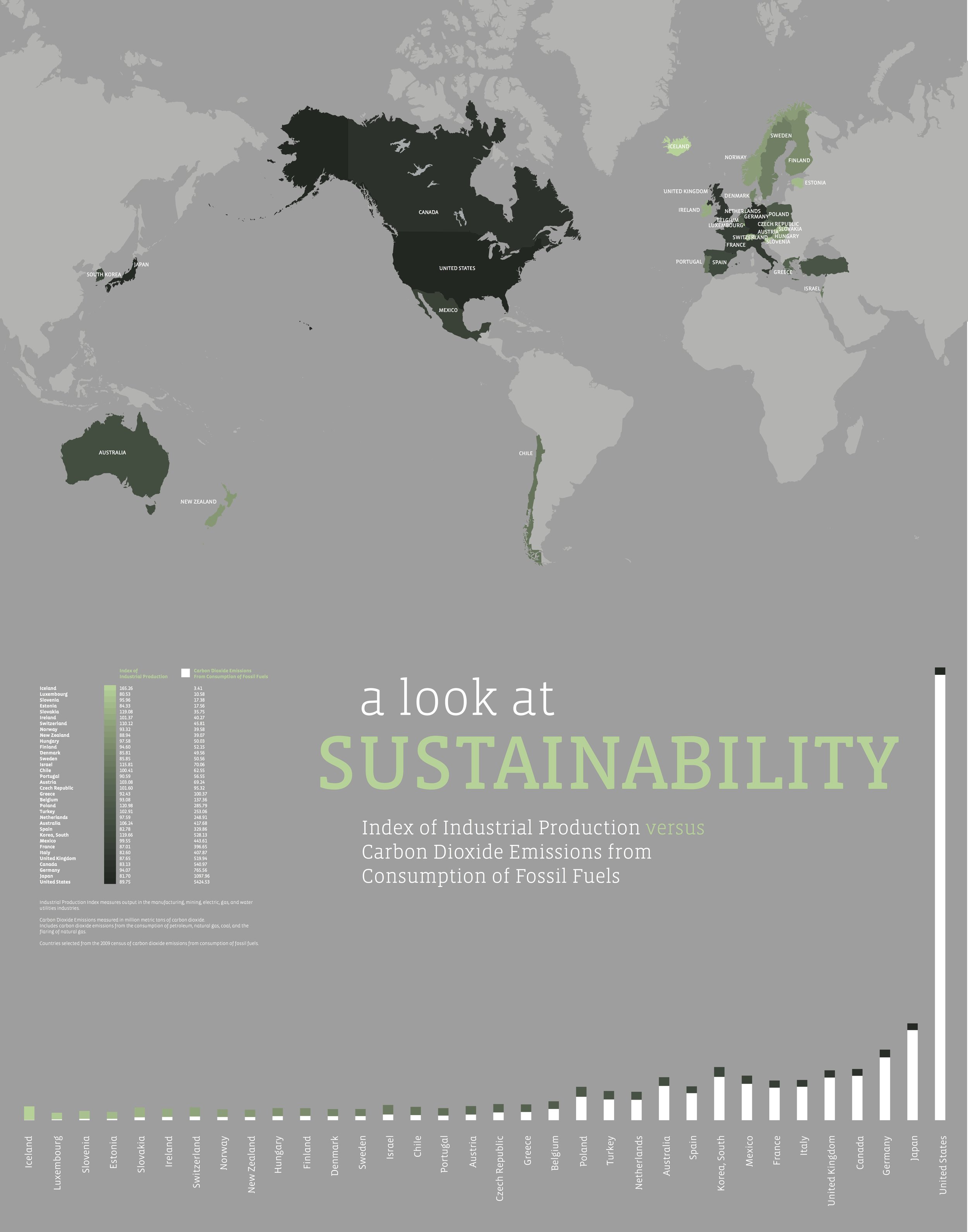
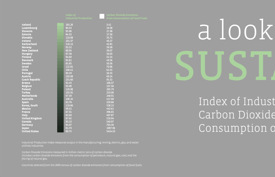
Sustainability Infographic
Data visualization of the index of industrial production vs. carbon dioxide emissions from the consumption of fossil fuels. Goal was to visually illustrate the positive relationship between the index of industrial production and carbon dioxide emissions.
Zoomed in elements below.
